
A hypothetical client wanted to create an app to compete in the cloud storage market while users expressed concerns with navigating the interface of current apps to quickly find and organize items.
Unique organization features
Clean and intuitive interface
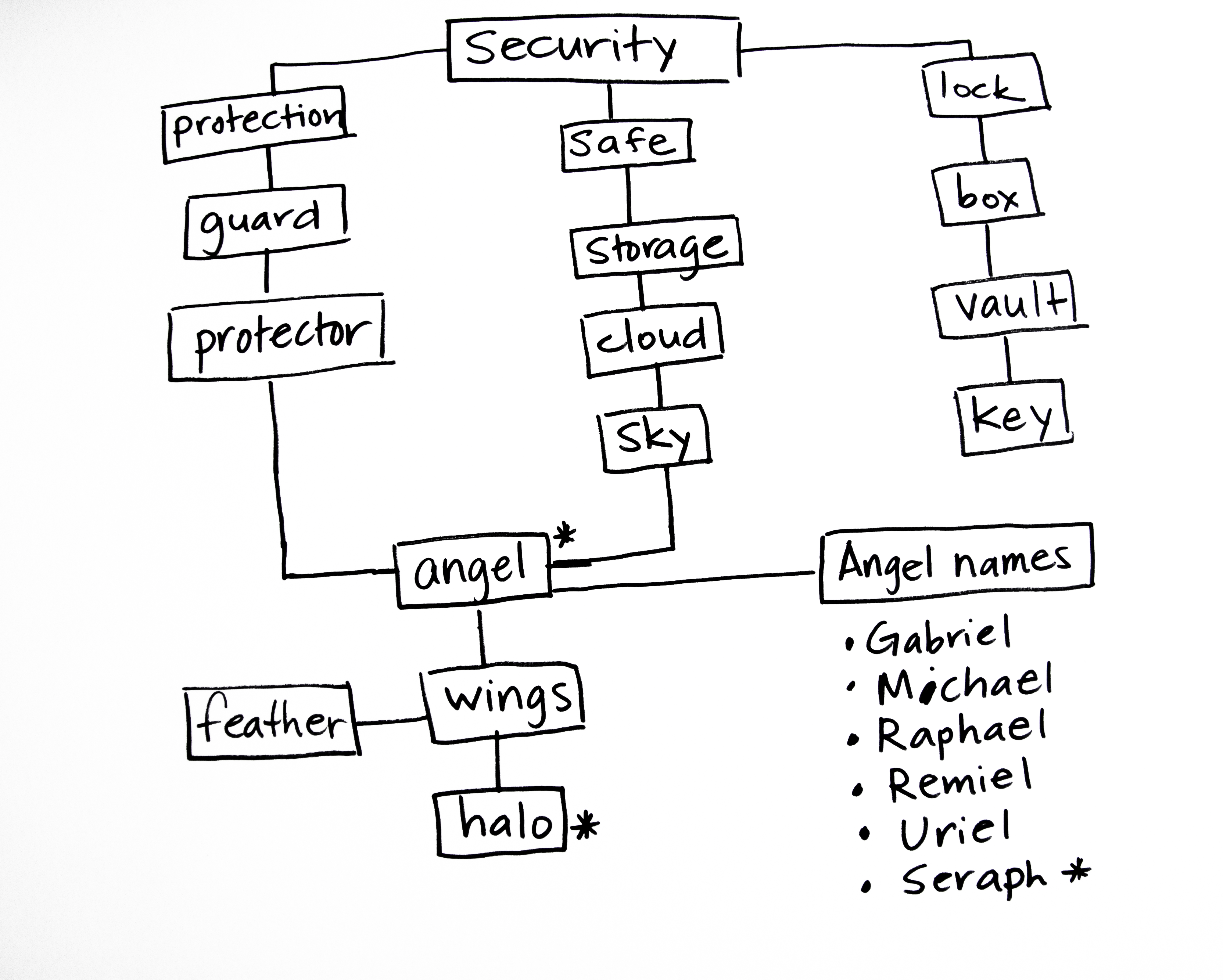
Instill trust and security in a new product
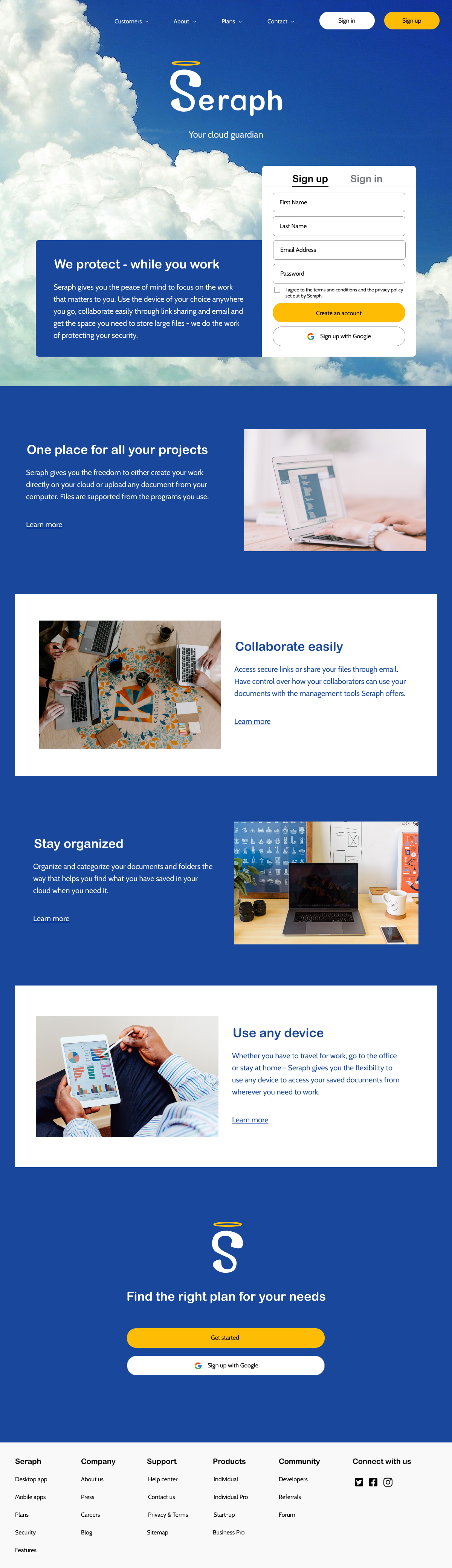
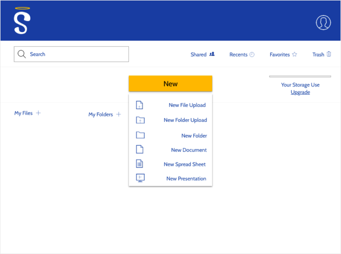
Seraph! A product that provides users with a central location to store all their work. Users can find all the features they use quickly on the main dashboard. Best of all, Seraph offers easy-to-use color coding features to optimize organization.
UX Researcher
UX Design
Visual Design
Branding
User Testing
User Surveys
Competitive Analysis
User Personas
User Stories
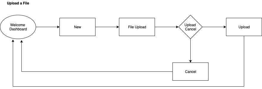
Site Map
User Flows
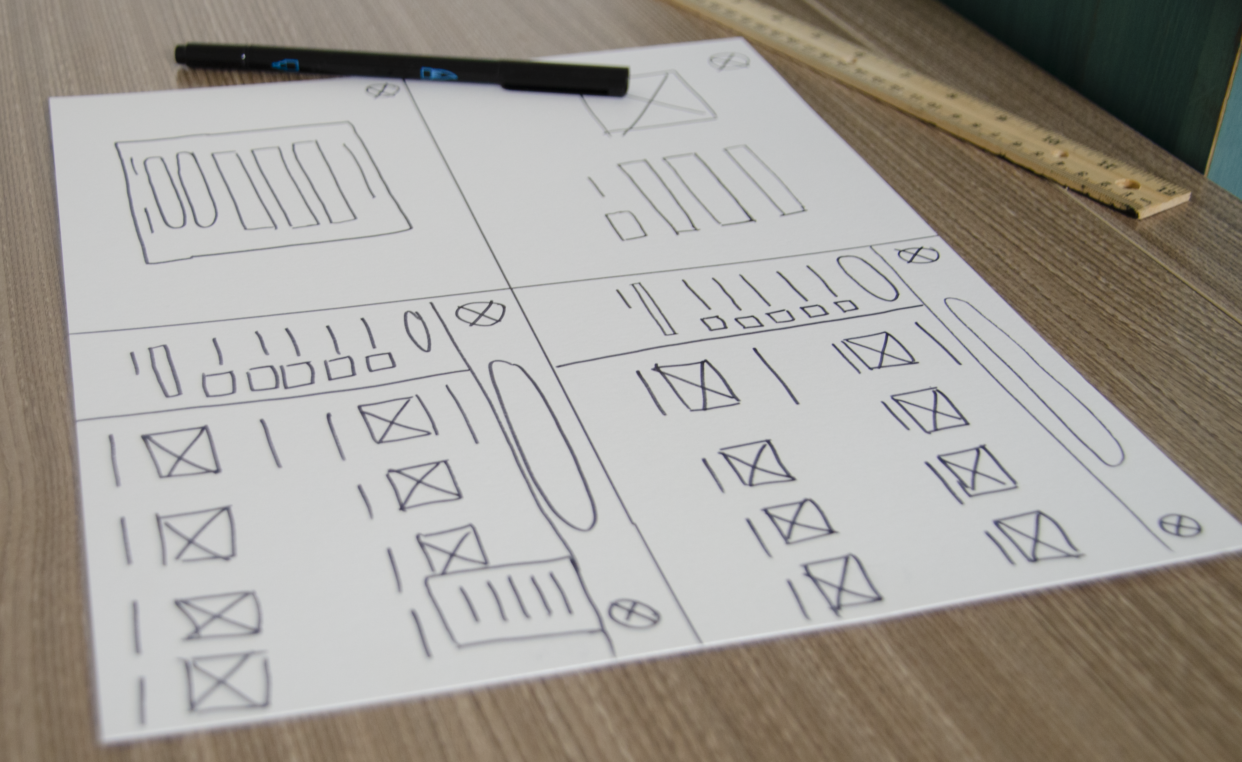
Wireframes
Branding
Style Guide
Hi-Fi Prototype
Tools:
Figma
Sketch
Usability Hub
Google Forms
Duration:
Three months


User surveys and competitive analysis helped me understand how a new product could fill in gaps where user's needs were not being met by current storage apps. The development of personas helped guide the rest of my process by combining what I had learned about users.
90% Are working professionals between the ages of 25-44
87% Use their cloud storage app to collaborate at work
65.2% Collaborate through email
60.9% Collaborate through link sharing
48.1% List keeping data secure as a major concern
40.7% List running out of storage as a major concern
85.2% Use their cloud storage for uploading content
70.4% Use their cloud storage for creating content
Many describe their ideal app as having a simple user interface that makes it easy to organize content, with plenty of space at an affordable price.


Film Editor | Age: 38 | Austin, TX
Teacher | Age: 32 | New York, NY
I priotized tasks and planned the map and flows for the app using the research I had gathered. I later experimented with various layouts in my initial sketches. The wireframes I created served as my lo-fi prototype for my first round of user testing.
After testing I realized that the new button and dropdown menus needed to be in a more prominent location for quick and easy access. I also needed to maximize space for content users would add.
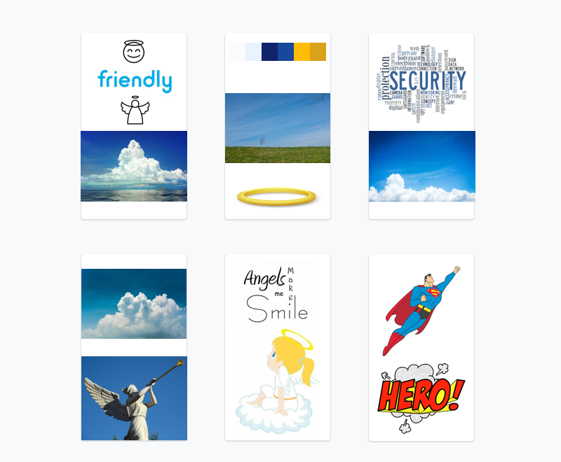
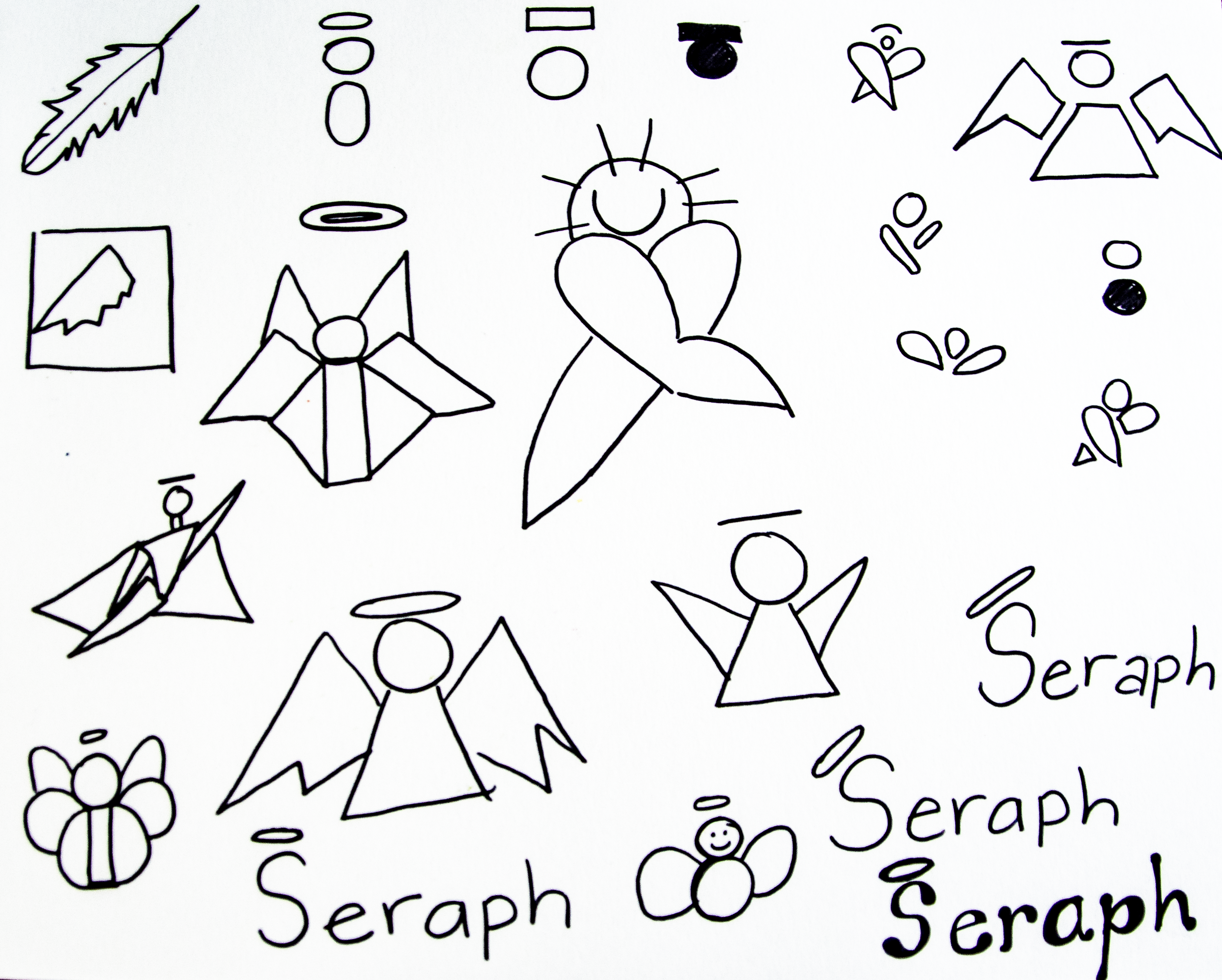
The brand needed to be trustworthy, friendly and professional. The color palette and font pairs I chose aligned with the brand personality while providing contrast and user accessibility. To create the logo, I drew inspiration from the S in Superman and topped it with a halo for a friendly and heroic mark.


In my next iterations I added the branding elements and made CTAs and menus more prominent to improve user experience. I later conducted a second round of user testing and preference tests to refine the product's visual design.


The second round of testing revealed to me that I needed to refine the branding by adding contrast and softening corners. I also needed to further save vertical space to optimize user workspace. Another important addition was the empty state and the darkened modal backgrounds.
The final round of user testing and feedback from other designers guided me to make changes that would optimize the use of vertical space and improve the visual cues to clarify messages.
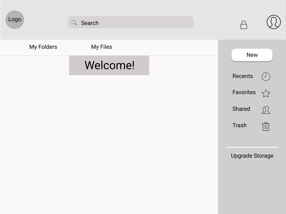
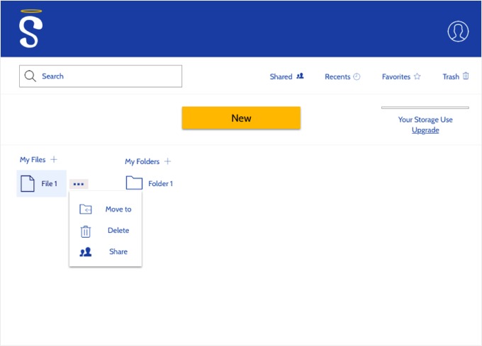
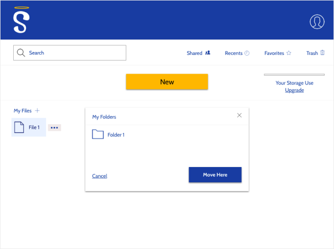
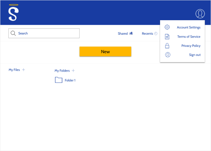
1.) Eyecatching CTA 2.) Vertical navigation on righthand side 3.) Elongated search bar inside header 4.) Empty state

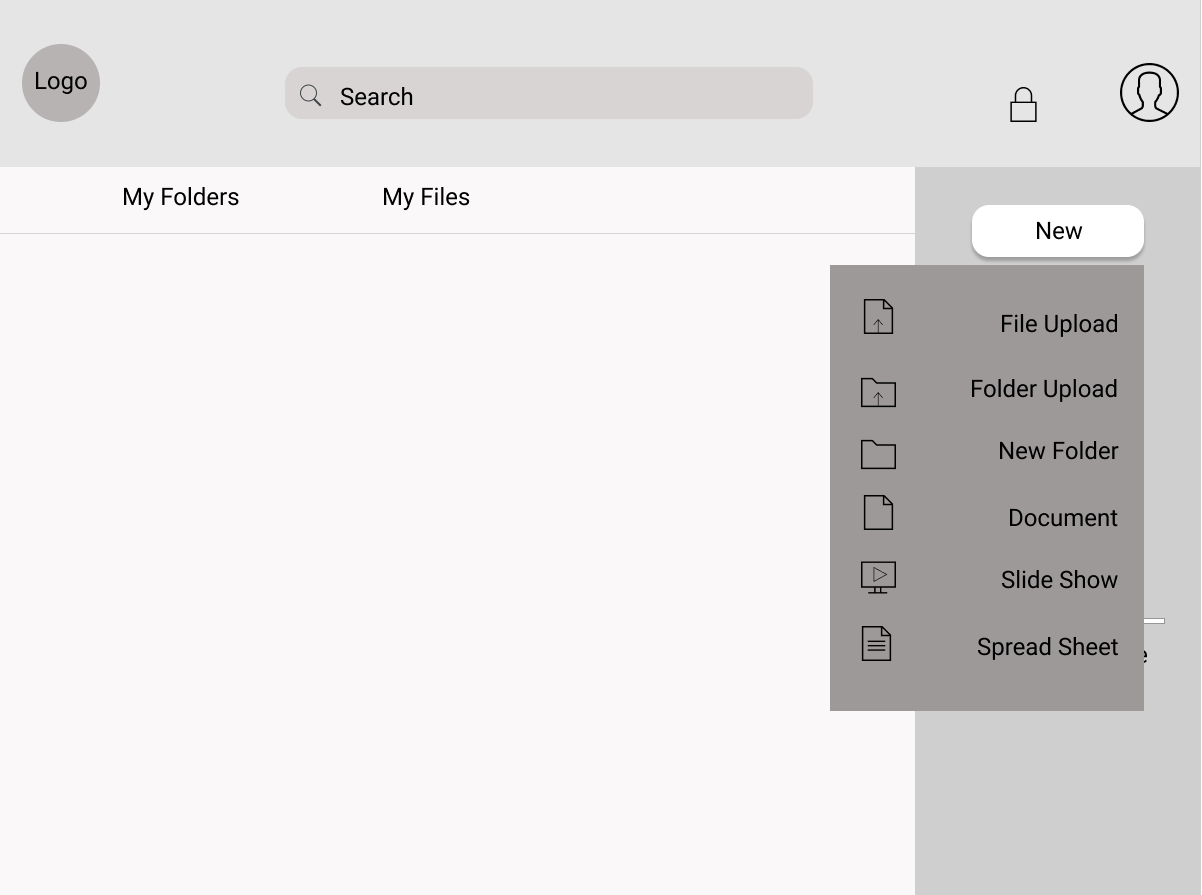
1.) Quick access to frequently used features 2.) Ability to color code files and folders 3.) Collaboration notifications

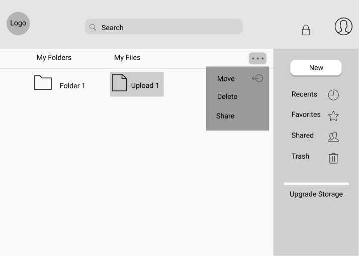
1.) Rounded corners to match branding 2.) Simplified icons to clarify message 3.) Redesigned files and folders 4.) Accessible feedback messages

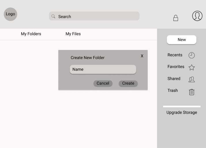
1.) Darkened backgrounds 2.) Rounded corners 3.) Titles bolded with black typography

1.) Saved activity log 2.) Ability to accept or reject changes
I learned a lot about the design process throughout the development of the Seraph app. I felt that it was challenging to come up with a new platform to compete in a market already oversaturated with trusted products. I realized after gathering feedback from users through surveys, interviews and testing that there is always something to improve upon to help a new competitor stand out. My research gave me the insights I needed to discover that excellent organization features would pave the way for a competitive app.
I think that my research could have reached a wider audience as far as age, gender and racial/ethnic backgrounds to better represent users that would be serviced with this product.